Sunday, 22 May 2016

Unit X Evaluation

This project was really personal for me. It explores the light and shade of mental health struggles, particularly anxiety. My intentions were to create a positive and playful collection that was to serve as an outlet to my emotions. I feel that I have fully fulfilled this.

Initial inspirations came from everyday dispositions, my surroundings and feelings, as well as chaotic art works from the likes of Heather Chontos, Kinda Khalidy and Emily Rickard. This all primarily influenced my colour decisions and drawing style. Whilst research into the Anxiety Artists Festival 2014 (‘The programme of visual art, film, communities and on-stage explored anxiety as a modern condition’), provided more conceptual thinking  and a theoretical approach.

My journey started in weave, where I wove typically to my previous style- inserting knots of yarns and inlaying blocks of colour. This was working for me, and I was happy with the samples, however they didn’t have the chaotic feel I wanted and I struggled to achieve a similar style to my drawings. After experimenting in previous projects with digital print, this now seemed the best option for me to try. Digital print enabled me to directly transfer my drawings onto fabric. The embroidery tufting machine also enabled me to create the texture I initially sought and substantially showed my journey from weave to print.

Throughout this process, my sketchbook was one of my most successful aspects and shows my journey as I kept up to date with contextualising my prints onto fashion frames. Colour changes are also referenced as I started to process my colour palette into something more contemporary and less extravagant. A textural interaction was important throughout, as I decided to embellish with beads and sequins. Scale was also imperative for context of my designs, which I have shown through four A1 digitally printed samples, whilst a sample of designs are shown on paper prints.

Contextualising this collection was my favourite aspect. I enjoyed shooting my own models in my chosen garments which was something totally new for me during my time at University. With having a slight background in photography, I was able to shoot eleven looks that I was satisfied with, and transferred a selection of my smaller A3 embellished samples onto these. As an alternative contextualisation, I also visualised a selection of my samples onto small interior cushions. These worked well and show diversity within the context of my designs.

As a collection overall, I’m happy with the way that my samples have turned out, and a lot of effort has been put into each one, particularly with embellishment. However, I feel that if I’d have had more time I’d have liked to embellish a selection of larger samples. For my degree show, I plan on having a large scale sample (A1) mounted on a stretched canvas, so this is something to think about over the next two weeks.

I believe my portfolio shows diversity in context and media. Having weave as well as digital print shows industry different skills. In terms of post graduation, my plan is to set up my own website for promotion and look into working freelance. I’d also like to gain experience by interning and learning more about the industry.


Monday, 28 March 2016

Unit X: Graduate Collection: Anxiety States


My Unit X project will be a personal exploration into anxiety through feelings and emotions, expressed through experimental, textured, hand-rendered, printed and woven textiles. Through individual experience, a feeling of worry, nervousness or unease about something with an uncertain outcome has become my life. My aim is to express my feelings into colourful printed and woven textiles with as much positivity as possible, (almost as a form of art therapy for myself). My intentional context for these samples will be for high-end fashion, conceptually looking at ‘wearing your fears and worries’. 


My initial inspirations have come from artists such as Heather Day, Heather Chontos, Kindah Khalidy and Ashley Goldberg that explore very chaotic art; art that I feel represents my feelings and emotions at their best. I've explored ideas around expressive womenswear that I'll be able to create through chaotic prints and textural woven samples. Bold colours and a textural interaction will be the most important aspect of this project.

The drawing; something that I never used consider as significant as other advancements within projects, has become a very important phase within my development. Using mixed media such as paints, markers and papers, I have freely explored my feelings through chaos and colour, and feel that these will be a great basis for my positive project as they are lively and fun. 


Using my drawings as initial fashion illustrations allowed me to process composition and context, and visualise the bearings for my sampling. It also enabled me to think about scale and decide that I want to work big (a new challenge for me). Whilst, drawing up some simple garment shapes assisted me in considering what kind of garments and the type of material I'd like to start sampling on. My samples started with weaving, which was my specialist media for my second year. A simple white 2/16s mercerised cotton, threaded up on straight, gave me the chance to use my chosen chunky yarns and for the bold colours to shine through. MY first woven fabrics consisted of a considerable amount of inlay. In the image below, I've started to experiment with tying in knots of yarn to make a textural tufting effect. 


The sample below was also woven on the same warp, with a multicoloured inlay of yarns pulled into small knots sit on the fabric. In relation to my drawings, I thought that this was a great start in consideration of detail. However, I have always felt restricted in the way that I work with weave. I feel that I don't have the technical mind to create large shapes on peg plans, and it doesn't leave much space regarding composition unless you inlay. This has moved me more towards digital print and embellishment as I feel it creates a lot more opportunity in creating my desired, imagined effect. I'd love to experiment on the tufting machine and with some hand embellishment such as sequins and beads. This enables me to still create the simple detail, create texture and keep my samples really fun and playful rather than flat.
This project was really important for me in the fact that it helped me decide that on one hand I enjoyed weave but felt that exploring with print suited the end result that I sought. 


The images underneath are my first digital design experiments. some of these were taken from textures that I'd drawn and re-sized, but mostly were taken from parts of my drawings that I'd 'Indexed' on Photoshop in order to create block colours. I had fun in developing these, and didn't seem to overthink them as they're only development samples. I think that this has had the desired effect as they're very 'free' in their style. I have decided to have these digitally printed on cotton canvas so that they have a boxy to the considered garments such as shirts and culottes. I now plan to embellish these using the tufting machine and using beads and sequins to give them a metallic, playful look. 


Before I decided to do each sample on cotton canvas, I experimented with different fabrics like crepe de chine (also in my portfolio). But this allowed me to decide what my prints looked best on. I also started to explore a range of placement prints to repeat prints which added an extra variety to my collection. Overall, I am really happy with the way that my development samples have turned out. I feel the colours show a positive, fun vibe, whilst the prints have fulfilled my concept through colour and areas of emotion by expressing the calmer times as well as my most anxious times. For example, this can be seen with calm surroundings of the anxious shapes. 


I feel a change in colour palette was needed to keep things fresh and contemporary. By removing a few select colours and adding a mint green and a navy, it completely changed the look of the collection. With a similar variation in composition I carefully considered prints that would compliment each other and that stuck to my initial concept. With every intention of embellishing these digital prints too, not being too extravagant was important. 


Context for this collection was extremely important. Since Unit X in my second year, I have become increasingly interested in fashion. This is not something that I would probably want to continue after University, but I enjoy contextualising for fashion and believe its much more experimental. For unit X I really wanted to push my boundaries and shoot my own garments to transfer my designs onto. The garments I chose were mostly boxy which suited my fabric choice of cotton canvas for my prints. 


When I first started weave, I was always more interested in design for interiors, and this is something that I can see myself going into after uni. I’ve done some quick visualisations of how my work would look within interiors, specifically cushions. I feel that the designs look much better as placement prints on cushions. Showing my work in an interiors context was definitely important to show diversity within my portfolio.
My degree show statement reads:


'My practice consists of a combination of digital print, weave and embellishment, with a focus upon a textural interaction. 
This project was very personal to me; it explores the light and shade regarding the struggles of mental health issues, and translates them into positive, playful and bold outcomes, designed for an eclectic fashion context. My investigations stem from every day dispositions and first hand responsiveness to my surroundings, which consistently motivates my research, development and drawing, whilst colour theory provides me with a visual outlet to my emotions.
My future intentions are to freelance within the creative industry.' 


Monday, 22 February 2016

Evaluation: Dash & Miller

Overall I feel that this has been my most successful project to date. I’ve enjoyed working for a company and gearing it towards my own chosen company or designer. For me, choosing Ashish to focus on was probably my best move, as it enabled me to keep my samples really fun and playful, which in return kept the whole project interesting and exciting. Dash and Miler wanted us to create a woven textile collection (as well as a print collection if we felt necessary), and I feel that I have truly challenged this brief by utilising hand techniques throughout. I understand that these methods aren’t commercially viable as they are time consuming and can’t be created in mass, but this may be something to look into regarding higher end fashion samples.

Initially having trouble with my first double cloth warp was a blessing in disguise when finding out what I liked and what I disliked. This also enabled me to try out new techniques such as ‘pick up’, even if I didn’t use this warp in the end. I went back to hand-rendered techniques that I’d used within my ‘Imperfections’ project and felt much more comfortable.


I understand that within the Dash and Miller brief, they expressed that they didn’t use digitally printed samples, however after not being inducted into the print room, this was my best shot in creating visualisations of what my prints would look like. I feel that the two collections work well together concerning shape, composition and colour choices. By doing a print collection, it also enabled me to utilise my collages/ drawings more obviously through creating shaped brushes on Photoshop. It also allowed me to experiment with composition much more quickly than if I was to weave it. A weakness of this project was timing. Due to personal issues, I’d lost out on a lot of time on the loom, and unfortunately felt rushed within the last week of weaving. This was a shame as I’d have liked to spend more time creating shape through tufting and inlay, but this is something to consider for my next project.

An example of Outward Facing was contacting and speaking to Jessica Simorte, an influential artist that I’d taken inspiration for my drawings from. Here, we spoke about the potential to collaborate with textile designers.

Overall, I’m happy in the progression of my own work and the samples that I have produced. I feel that my collections are well suited to my chosen designer, Ashish. They are fun and playful which was exactly the look I was going for. I also believe I have pushed the boundaries in terms of hand techniques and adding a small amount of embroidery to my woven samples. I’d like to pursue this within Unit X, as I feel I have finally found my ‘style’ of working.

Dash and Miller Live Brief

After what I felt was a very successful first project, I have decided that I would like to continue with my 'Imperfections' concept but focus it upon the Dash and Miller woven textiles/ print live brief. 'Dash and Miller are a textile design studio specialising in hand-woven swatches to be used as inspiration for apparel and home interiors fabrics. Their clients span a broad range of companies from both high-end and high-street levels of these industries.’ Dash and Miller have asked that we apply our sample collection to a specific company or designer; I have chosen Ashish, a fashion company that specialise in the eccentric. 


I was predominantly inspired by Ashish’s S/S 2016 androgynous collection, which followed sequined models down the runway on skateboards. The collection consisted of both men and women and truly challenged gender identity. When looking back through Ashish' past collections, I have noticed that they don't utilise any experimental woven textiles, which is something that I would like to challenge. It’s important to me that my samples are kept playful and fun in their appearance, as well as developing my colour palette and weave techniques. In the presentation of my last project, it was continuously mentioned how I was creating samples with an embroidery feel to them. This is an aspect that I would like to pursue. 

Mood boards are always an important part of my research, they allow me to gather my ideas in my concept as well as my colour palette. I have settled with a pastel based colour palette, with some slight bolder colours. My main inspiration has been taken from images that inspire me on Pinterest, mainly artists and fashion illustrators. Once I'm on the loom, I become more aware of what colours work well and what don’t, so I plan on expanding my colour decisions once I start weaving. I feel that my mood board portrays the playful and fun theme that I’m going for. 


I have taken inspiration for my development drawings from my last project 'Imperfections'. I have specifically concentrated more on stylistic shapes, including more developed 'imperfections' within the details. Inspiration for these drawings have also come from Jessica Simorte (http://jessicasimorte.com/home.html), who after contacting myself, I spoke to her about her influences, which she explained as the details within her surroundings. Making contact with with Jessica Simorte demonstrates ‘outward facing’, especially when we talked about her potentially wanting to collaborate with textile designers in the future. My shapes have been developed from details on the human form (see my first project). 


I started to draw using a mixture of medias, mainly pro markers, fine line pens and gouache paint. I have settled on the colour palette above and plan on taking two colours from this to create my warp. I am thinking about using a technique called ‘pick up’ for my next warp, which would mean threading a double cloth. Within my drawings, I have considered this as you can create any shape and composition with this method.


For my warp, I decided to challenge myself and do something I have never experimented with before, double cloth. Double cloth would allow me to interchange colours, as well as pull shapes from my bottom cloth with a technique called 'pick up', to appear on the top (vice versa on the back). I felt that this would help me translate my drawings very literally when weaving.


After a week and a half of attempting to work with my lilac/ mint warp, I finally decided that it didn't suit the hand manipulated way I work. I struggled with the colours initially and felt very restricted with what I could use as my weft. The way I had threaded up (on straight) was also a problem for me when thinking about creating peg plans. The decision to scrap my warp and start again has now set me back three weeks, but I have realised that I need to take steps back in order to take steps forward. Overall, I am glad I experimented and took the journey to try something new. It has made me realise what I like and don't like. My new warp is now white (2/16s mercerised cotton) which will enable me to use any colour in my palette as my weft (which will also be 2/16s mercerised cotton), and threaded up on point. I have also realised that creating peg plans isn’t suited to my style of working, I believe I suit much more hand manipulated techniques such as inlaying, knotting and creating tufts, much more like my first self- initiated project. This is something that I would like to explore further, I'm looking forward to the next couple of weeks of weaving. 


After changing my warp I felt it necessary to change my sketchbook as I became more frustrated with the work I had already produced. I will still submit this work as part of my development stages. Now in terms of direction, to avoid decision making taking too long within my colour palette, I decided to take colour inspiration from a Kindah Khalidy mixed media piece of work (shown in the board below). I chose this piece as I love her style of drawing, felt that it was fun and playful in the shapes and colours, and believed that it would work well with my chosen designer ‘Ashish’. Inspiration for my new drawings and shapes also originated from this specific painting too. 


Initial drawings came from shapes that I have picked up since my self- initiated project, as well as artists that have inspired me such as Ellsworth Kelly, Victor Passmore, Linda Linko and Jessica Simorte (see Dash & Miller portfolio). Collages were my main form of drawing as I found it easier to experiment with different shapes, sizes, colours and compositions this way. When re-reading the Dash & Miller brief, I noticed that there was an opportunity to explore other medias, not just weave. I felt that my drawings were well suited when forming a small print collection on Photoshop. ‘In addition they also carry a small collection of hand-printed and mixed media designs to complement the woven samples… I plan on the prints running alongside my woven samples and contributing to my final fashion line up.


I understand that Dash and Miller tend not to use digital print as a form of design, however as I have not been inducted in the print room, I had to resort to digital visualisations of what my prints would look like. On Photoshop, it really enabled me to develop my own digital skills, teaching myself to create my own shape brushes and layering. Creating digital samples to support my weaving in the future is something that I would really like to explore as I enjoyed it so much and didn’t feel as restricted as I do when I’m on the loom. This is why when I’m weaving, I use techniques such as inlay and creating shaped tufts as they enable me to play with size and composition.

My woven samples started with really simple plain weave colour testers. Here I was able to decide which worked best as a weft, and which colours would be best being used as inlay/ surface textures.  


Overall I am happy with my woven samples, however I do feel like they were slightly rushed which I regret. This has always been a downfall of mine as I tend to leave things to last minute, something that I wish to improve on in Unit X. I have 
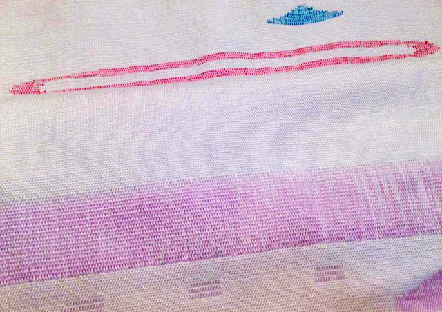
added embroidery which is something that I planned on since the start. I feel like this is really pushing the brief in using other media, but an aspect that I have happy to challenge. If I had had more time, I would have liked to try and created more shapes that I used within my drawings and prints by inlaying and tufting, however this is a really time consuming technique.  
In terms of context, it has been obvious from the start where my work would sit within the creative world. For Ashish as my chosen company, it was important for me to keep my samples playful in their aesthetics, which I feel like I have achieved. The garments in themselves also have a fun appeal to them, catering to the younger audience that Ashish designs for.  

Sunday, 21 February 2016

Evaluation: Self Initiated/ Bradford

I feel like I've finally found my niche with this project. I came into my self-initiated brief thinking that I wanted to make for interiors- and this decision quickly changed once I started to visualise my samples on garments. It was important to me to keep my work fun and playful throughout, which enabled me to keep things exciting and interesting for myself.

An aspect of inspiration that worked well for me was exploring none textile designers work. Nina Canell and George Rousse in particular assisted me to put my ideas across more conceptually as well as aesthetically through creating a fabric.

I believe that my final samples are experimental in terms of the fabric that is usually associated with weave, and also have very hand crafted qualities which is something that I would like to continue. In my final presentation, I was told by Nigel that I was unintentionally re-creating typical embroidery techniques such as tufting (incorporating tassels) and darning (inlay)- this could be somewhat interesting to look into within my next project. I felt I have really pushed my boundaries within weave as I only rarely used a peg plan, utilising mainly hand-rendered techniques. This is something that I would like to pursue in future projects.

The samples that didn’t work so well for me were the ones where I’d created no texture, as I feel that this became the main purpose of my project (re-creating and translating moles, freckles and stretch marks) even if I had created imperfections within the face of the cloth by inlaying extra weft. An aspect that I would also like to improve is my drawings. Although it was easy to create a lot of weave visualisations in such a short amount of time in Photoshop, I much prefer the look of these by hand which I hope to do in my next project.


I feel that my context is the strongest aspect of my ‘Imperfections’ project, and it positively demonstrates the idea of confidently ‘wearing’ your imperfections. I was particularly content with the idea of using the reverse of my samples as a surface in itself, for example, the back of the knotted tassels translated perfectly into small dots.

This project will start to add a completely different direction to my portfolio which will be a great grounding in diversity. In terms of my next project, I want to start developing my colour palette and making it broader. I would also like to look into potentially creating a collection of digitally printed samples to run alongside my weaves as I enjoyed utilising my Photoshop skills. I would also like to continue with the hand-rendered techniques that I have pursued this time around as I feel that this could really become my ‘style’ of working.

This project will start to add a completely different direction to my portfolio which will be a great grounding in diversity. In terms of my next project, I want to start developing my colour palette and making it broader. I would also like to look into potentially creating a collection of digitally printed samples to run alongside my weaves as I enjoyed utilising my Photoshop skills. I would also like to continue with the hand-rendered techniques that I have pursued this time around as I feel that this could really become my ‘style’ of working.


Self Initiated/ Bradford Textiles Live Brief

My starting point for the Bradford Textiles live brief is 'Imperfection' and the question that I have chosen is 'A woven fabric for either fashion or interiors'- focusing on fashion. This brief allows a vast scope for anything I want to create, and allows me to carry over my summer work. The concept for my self- initiated brief came from the idea of women's imperfections, and how it is those that actually make you beautiful. I started my research with Pinterest, looking into images that had elements of imperfection within them. These imperfections translated perfectly as interruptions once I had started to look at relatable weaving techniques. 


I have looked at a specific anonymous quote to use as my main inspiration which follows the words ‘Curves and dimples are beautiful. The women that inspire me are not necessarily beautiful by society standards. They all have wrinkles, or stretch marks, birthmarks and moles, scars and rolls. These blemishes tell their stories. The stories of how they have obtained the largest hearts and the biggest smiles. They are strong and honest. They are more than just role models. They are who should be photographed’. I believe that this quote holds a strong basis on the themes that I would like to explore. Creating beautiful spots, marks and dimples within my own woven samples. I have looked at Nina Canell and George Rousse as my main inspirational artists. Nina Canell’s (a Swedish sculpture and installation artist, shown below) work  specifically struck me as she demonstrates interruptions through fluorescent light tubes, revealing the beautiful in the disruptions. This was inspiring for me as the spots that your eyes are drawn to are so striking, just like how I see them upon women.


Creating a mood board of inspirational images has enabled me to make decisions of how I’d like my collection to look, as well as the colours and scale and stimulating drawing influences such as Sandra Thomsen and Jessica Garvin. However, Moodboards mainly allow me to express a colour palette, and I would personally like to concentrate pastels, pinks and fleshy tones.

Within our first week we had to start making our warp. My summer work was mainly colour studies that allowed me to make decisions quickly on the yarn selection. The colours that I had been working with were mainly pinks, pastel colours and flesh tones. I decided I wanted something delicate and with a shine, consequently going for an end on end baby pink and cream silk.


My initial drawings have started with very simple collages and shapes that represent the idea of 'imperfection' within the human form. I have experimented using mixed medias of collaged papers, paints and fine liner pens to re-create what I felt represented imperfection. I have translated moles and freckles into small dots and stretch marks into line lines upon the paper. My next step is to develop my drawings, and look into weave techniques which will enable me to re-create and re-design these drawings.


Having constant inspiration from working professional creatives enabled me to visualise more clearly where I want my work to fit into context. I like to know the context of my samples before I start, as I feel it’s necessary when working on the loom. I looked into the work of Temple and Webster, a home-wares company, as well as Sun Choi (a 2013 knitwear fashion graduate) and Evelien van Pruissen (a fashion graduate), alongside Mia Christophers sketchbooks which help me to visualise the style of my work alongside the context. Sun Choi’s work has specifically inspired me, even though she is a knitwear designer. After looking through her graduate collection, she has developed a unique style where she focuses upon the textures upon the surface. This is an aspect that I would like to pursue through woven samples. I have decided that I would like to do this collection for fashion (even though I was so put off by my last second year Unit X project), I feel that my samples would be most suited for this. 


This week I started to weave. I have experimented using chunkier yarns that I’d selected from an external yarn store, tying in knots of tassels (a technique that I’ve never seen to be done before). I felt that this especially expressed the term ‘imperfections’, and believed that this was a good start to an alternative collection. This sample gave me the inspiration I needed for the rest of my samples when looking into surface textures, and from this I started to experiment with compositions and putting knots together in blocks. (As seen below)


When looking into textural weaving as inspiration, one person that I came across was Maryanne Moodie. Maryanne lives and works in Brooklyn, New York. This natural fibre obsessed lady mainly creates work commercially, weaving wall hangings to buy and is known for her unlikely colour combinations, something that I wish I had a better eye for! Maryanne specialises in texture within her weavings and although I understand that she does not sample for fashion or interiors, I am especially influenced by her techniques, researching the ways in which she ties in her yarns for external touch. Maryanne works on a hand loom, which is an aspect of weaving that I would specifically like to try in the future as it’s much easier to create shapes within the weaves this way.  


Generating more developed images in Photoshop using my initial drawings allowed me to visualise clearly how I wanted my samples to look aesthetically within the third week of weaving. Here I have introduced a light/ dark blue as I felt it necessary as my palette has suddenly become so refined to pinks, fleshes and corals. The reason I have used Navy and light blue is due to the contrast they create, consequently making the ‘imperfect’ colours and textures stand out. You’ll notice within my samples that these new colours have only been used as backgrounds to my work. 


Samples that I believe haven’t worked so well are the ones where I haven’t fashioned any texture, even though they may have some form of inlay and shaping within them. I feel that this project has become about forming surfaces relating to dimples, stretchmarks and moles, rather than flat shapes upon the face.


The above sample is the sample I've chosen for the Bradford Textiles live brief. I chose this as it was my most developed sample in terms of colour and experimentation. One thing thing that I love about it is that I have used both sides within my final garment visualisations, which could also be something to take on board (reversible fabric) when thinking about my next project. The random dots suit my Imperfection concept the most, contrasting with a subtly shiny embroidery thread/ coral twist yarn as the main background weft.  


When looking into context for my final collection, I had already decided that I would like to sample for fashion. With the samples being so textural and playful, I felt that they needed garments that paralleled this. I have focused on oversized jackets, wide skirts and shorts and smock dresses. The style of these garments are well suited to the aesthetics of my samples. For the Bradford textiles live brief, I chose the question ‘A woven fabric for either fashion or interiors’, and I feel that I have fully pushed the terms of ‘woven fabric’ and worked well to the brief. My favourite aspect of my collection is that the majority of the samples are reversible, demonstrated this in my visualisations by using both sides. This makes my samples extra diverse.
  
Overall I am extremely happy with the way that my samples have turned out with and without context.